


Trending Music
from Real Artists
Without the Copyright Headache
The easiest way to get copyright-free music from real artists for your videos. Trusted by 1M+ creators, free to use, and better music than any production library site ✌️
LOVELOVELOVE
everything feels like a movie

'%3e%3cpath%20d='M8.125%2015.9811L8.125%2031.0189'%20stroke='white'%20stroke-width='3.75945'%20stroke-linecap='round'/%3e%3cpath%20d='M14.3906%2015.9811L14.3906%2031.0189'%20stroke='white'%20stroke-width='3.75945'%20stroke-linecap='round'/%3e%3cpath%20d='M20.6562%2010.3419L20.6563%2036.658'%20stroke='white'%20stroke-width='3.75945'%20stroke-linecap='round'/%3e%3cpath%20d='M26.9219%2010.3419L26.9219%2036.658'%20stroke='white'%20stroke-width='3.75945'%20stroke-linecap='round'/%3e%3cpath%20d='M33.1875%2010.3419V36.658'%20stroke='white'%20stroke-width='3.75945'%20stroke-linecap='round'/%3e%3cpath%20d='M39.4531%205.95593V41.0441'%20stroke='white'%20stroke-width='3.75945'%20stroke-linecap='round'/%3e%3cpath%20d='M45.7188%2010.3419V36.658'%20stroke='white'%20stroke-width='3.75945'%20stroke-linecap='round'/%3e%3cpath%20d='M51.9844%2010.3419V36.658'%20stroke='white'%20stroke-width='3.75945'%20stroke-linecap='round'/%3e%3cpath%20d='M58.25%2010.3419V36.658'%20stroke='white'%20stroke-width='3.75945'%20stroke-linecap='round'/%3e%3cpath%20d='M64.5176%205.95593V41.0441'%20stroke='white'%20stroke-width='3.75945'%20stroke-linecap='round'/%3e%3cpath%20d='M70.7832%2013.4748V33.5252'%20stroke='white'%20stroke-width='3.75945'%20stroke-linecap='round'/%3e%3cpath%20d='M77.0488%2010.3419V36.658'%20stroke='white'%20stroke-width='3.75945'%20stroke-linecap='round'/%3e%3cpath%20d='M83.3145%2013.4748V33.5252'%20stroke='white'%20stroke-width='3.75945'%20stroke-linecap='round'/%3e%3cpath%20d='M89.5801%205.95593V41.0441'%20stroke='white'%20stroke-width='3.75945'%20stroke-linecap='round'/%3e%3cpath%20d='M95.8457%2013.4748V33.5252'%20stroke='white'%20stroke-width='3.75945'%20stroke-linecap='round'/%3e%3cpath%20d='M102.111%2012.2217V34.7784'%20stroke='white'%20stroke-width='3.75945'%20stroke-linecap='round'/%3e%3c/g%3e%3cpath%20d='M8.125%2015.9811L8.125%2031.0189'%20stroke='white'%20stroke-width='3.75945'%20stroke-linecap='round'/%3e%3cpath%20d='M14.3906%2015.9811L14.3906%2031.0189'%20stroke='white'%20stroke-width='3.75945'%20stroke-linecap='round'/%3e%3cpath%20d='M20.6562%2010.3419L20.6563%2036.658'%20stroke='white'%20stroke-width='3.75945'%20stroke-linecap='round'/%3e%3cpath%20d='M26.9219%2010.3419L26.9219%2036.658'%20stroke='white'%20stroke-width='3.75945'%20stroke-linecap='round'/%3e%3cpath%20d='M33.1875%2010.3419V36.658'%20stroke='white'%20stroke-width='3.75945'%20stroke-linecap='round'/%3e%3cpath%20d='M39.4531%205.95593V41.0441'%20stroke='white'%20stroke-width='3.75945'%20stroke-linecap='round'/%3e%3cpath%20d='M45.7188%2010.3419V36.658'%20stroke='white'%20stroke-width='3.75945'%20stroke-linecap='round'/%3e%3cpath%20d='M51.9844%2010.3419V36.658'%20stroke='white'%20stroke-width='3.75945'%20stroke-linecap='round'/%3e%3cpath%20d='M58.25%2010.3419V36.658'%20stroke='white'%20stroke-width='3.75945'%20stroke-linecap='round'/%3e%3cpath%20d='M64.5176%205.95593V41.0441'%20stroke='white'%20stroke-width='3.75945'%20stroke-linecap='round'/%3e%3cpath%20d='M70.7832%2013.4748V33.5252'%20stroke='white'%20stroke-width='3.75945'%20stroke-linecap='round'/%3e%3cpath%20d='M77.0488%2010.3419V36.658'%20stroke='white'%20stroke-width='3.75945'%20stroke-linecap='round'/%3e%3cpath%20d='M83.3145%2013.4748V33.5252'%20stroke='white'%20stroke-width='3.75945'%20stroke-linecap='round'/%3e%3cpath%20d='M89.5801%205.95593V41.0441'%20stroke='white'%20stroke-width='3.75945'%20stroke-linecap='round'/%3e%3cpath%20d='M95.8457%2013.4748V33.5252'%20stroke='white'%20stroke-width='3.75945'%20stroke-linecap='round'/%3e%3cpath%20d='M102.111%2012.2217V34.7784'%20stroke='white'%20stroke-width='3.75945'%20stroke-linecap='round'/%3e%3cdefs%3e%3cfilter%20id='filter0_f_4422_38342'%20x='-2.61691'%20y='-0.999298'%20width='115.468'%20height='48.9987'%20filterUnits='userSpaceOnUse'%20color-interpolation-filters='sRGB'%3e%3cfeFlood%20flood-opacity='0'%20result='BackgroundImageFix'/%3e%3cfeBlend%20mode='normal'%20in='SourceGraphic'%20in2='BackgroundImageFix'%20result='shape'/%3e%3cfeGaussianBlur%20stdDeviation='1.61119'%20result='effect1_foregroundBlur_4422_38342'/%3e%3c/filter%3e%3c/defs%3e%3c/svg%3e)
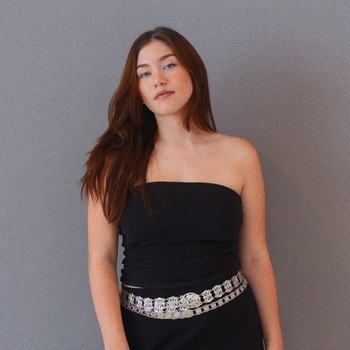
Anja Kotar
April [Thematic Exclusive]
Laura Munan
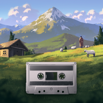
Making Days
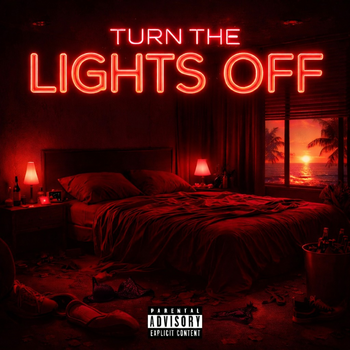
TRVR?
Dandelions
Lyle Kam
internet crush
HOAX
Moon Moon Baby


Join 1 Million+
Creators Using Thematic to Soundtrack Their Videos

Trusted & loved by 1M+ creatives worldwide
Where Creators
and Music Artists Connect
More than a music library, Thematic is a collaborative and supportive community. Creators license music from their favorite music artists in exchange for promotion. It’s a win-win
Creators make better videos by using trending music


'%20stroke-width='2'%20/%3e%3cpath%20d='M0%20380.388H376.471C412.837%20380.388%20444.594%20385.482%20444.594%20320.388C444.594%20255.39%20444.594%20272.387%20444.594%20237.887C444.594%20211.39%20455.862%20190.887%20490.692%20190.887C516.815%20190.887%20575.889%20190.221%20607.987%20190.887'%20stroke='url(%23paint1_linear_4209_44100)'%20stroke-width='2'%20/%3e%3cpath%20d='M9.74023%20190.591L607.475%20190.591'%20stroke='url(%23paint2_linear_4209_44100)'%20stroke-width='2'%20/%3e%3c/g%3e%3cdefs%3e%3clinearGradient%20id='paint0_linear_4209_44100'%20x1='608.5'%20y1='95.9448'%20x2='0'%20y2='95.9448'%20gradientUnits='userSpaceOnUse'%20%3e%3cstop%20stop-color='%238643E5'%20/%3e%3cstop%20offset='1'%20stop-color='%238643E5'%20stop-opacity='0'%20/%3e%3c/linearGradient%3e%3clinearGradient%20id='paint1_linear_4209_44100'%20x1='607.987'%20y1='285.536'%20x2='0'%20y2='285.536'%20gradientUnits='userSpaceOnUse'%20%3e%3cstop%20stop-color='%238643E5'%20/%3e%3cstop%20offset='1'%20stop-color='%238643E5'%20stop-opacity='0'%20/%3e%3c/linearGradient%3e%3clinearGradient%20id='paint2_linear_4209_44100'%20x1='617.215'%20y1='190.591'%20x2='9.2276'%20y2='190.591'%20gradientUnits='userSpaceOnUse'%20%3e%3cstop%20stop-color='%238643E5'%20/%3e%3cstop%20offset='1'%20stop-color='%238643E5'%20stop-opacity='0'%20/%3e%3c/linearGradient%3e%3c/defs%3e%3c/svg%3e)
'%20stroke-width='2'/%3e%3cpath%20d='M1.93212%200L1.93212%20367.492C1.93213%20402.991%20-1.61329%20433.991%2043.6905%20433.991C88.9271%20433.991%2077.0972%20433.991%20101.108%20433.991C119.55%20433.991%20132.557%20443.501%20132.557%20477.5C132.557%20502.999%20132.058%20497.5%20132.557%20529'%20stroke='url(%23paint1_linear_4339_52170)'%20stroke-width='2'/%3e%3cpath%20d='M133.551%2010L132.553%20529'%20stroke='url(%23paint2_linear_4339_52170)'%20stroke-width='2'/%3e%3c/g%3e%3cdefs%3e%3clinearGradient%20id='paint0_linear_4339_52170'%20x1='198.797'%20y1='593.987'%20x2='198.797'%20y2='0'%20gradientUnits='userSpaceOnUse'%3e%3cstop%20stop-color='%238643E5'/%3e%3cstop%20offset='1'%20stop-color='%238643E5'%20stop-opacity='0'/%3e%3c/linearGradient%3e%3clinearGradient%20id='paint1_linear_4339_52170'%20x1='67.9461'%20y1='593.487'%20x2='67.9461'%20y2='0'%20gradientUnits='userSpaceOnUse'%3e%3cstop%20stop-color='%238643E5'/%3e%3cstop%20offset='1'%20stop-color='%238643E5'%20stop-opacity='0'/%3e%3c/linearGradient%3e%3clinearGradient%20id='paint2_linear_4339_52170'%20x1='132.537'%20y1='537.457'%20x2='133.556'%20y2='9.5549'%20gradientUnits='userSpaceOnUse'%3e%3cstop%20stop-color='%238643E5'/%3e%3cstop%20offset='1'%20stop-color='%238643E5'%20stop-opacity='0'/%3e%3c/linearGradient%3e%3c/defs%3e%3c/svg%3e)

'%20stroke-width='2'/%3e%3cpath%20d='M609.5%201.61234L242.31%201.61234C206.84%201.61236%20175.866%20-3.48185%20175.866%2061.6125C175.866%20126.61%20175.866%20109.613%20175.866%20144.113C175.866%20170.61%20164.875%20191.113%20130.904%20191.113C105.425%20191.113%2032.3069%20192.667%201%20192'%20stroke='url(%23paint1_linear_4209_44076)'%20stroke-width='2'/%3e%3cpath%20d='M600%20192L1.99968%20192.004'%20stroke='url(%23paint2_linear_4209_44076)'%20stroke-width='2'/%3e%3c/g%3e%3cdefs%3e%3clinearGradient%20id='paint0_linear_4209_44076'%20x1='15.9999'%20y1='286.055'%20x2='609.5'%20y2='286.055'%20gradientUnits='userSpaceOnUse'%3e%3cstop%20stop-color='%238643E5'/%3e%3cstop%20offset='1'%20stop-color='%238643E5'%20stop-opacity='0'/%3e%3c/linearGradient%3e%3clinearGradient%20id='paint1_linear_4209_44076'%20x1='16.4999'%20y1='96.464'%20x2='609.5'%20y2='96.464'%20gradientUnits='userSpaceOnUse'%3e%3cstop%20stop-color='%238643E5'/%3e%3cstop%20offset='1'%20stop-color='%238643E5'%20stop-opacity='0'/%3e%3c/linearGradient%3e%3clinearGradient%20id='paint2_linear_4209_44076'%20x1='-7.74474'%20y1='192.004'%20x2='600.513'%20y2='192'%20gradientUnits='userSpaceOnUse'%3e%3cstop%20stop-color='%238643E5'/%3e%3cstop%20offset='1'%20stop-color='%238643E5'%20stop-opacity='0'/%3e%3c/linearGradient%3e%3c/defs%3e%3c/svg%3e)
'%20stroke-width='2'/%3e%3cpath%20d='M265.183%20530L265.183%20162.508C265.183%20127.009%20268.729%2096.0093%20223.425%2096.0093C178.188%2096.0093%20190.018%2096.0093%20166.007%2096.0093C147.565%2096.0093%20134.558%2086.4993%20134.558%2052.5C134.558%2027.0005%20135.057%2032.5%20134.558%201'%20stroke='url(%23paint1_linear_4339_52146)'%20stroke-width='2'/%3e%3cpath%20d='M133.557%20520L134.554%200.999996'%20stroke='url(%23paint2_linear_4339_52146)'%20stroke-width='2'/%3e%3c/g%3e%3cdefs%3e%3clinearGradient%20id='paint0_linear_4339_52146'%20x1='68.3203'%20y1='-63.9875'%20x2='68.3203'%20y2='530'%20gradientUnits='userSpaceOnUse'%3e%3cstop%20stop-color='%238643E5'/%3e%3cstop%20offset='1'%20stop-color='%238643E5'%20stop-opacity='0'/%3e%3c/linearGradient%3e%3clinearGradient%20id='paint1_linear_4339_52146'%20x1='199.169'%20y1='-63.4873'%20x2='199.169'%20y2='530'%20gradientUnits='userSpaceOnUse'%3e%3cstop%20stop-color='%238643E5'/%3e%3cstop%20offset='1'%20stop-color='%238643E5'%20stop-opacity='0'/%3e%3c/linearGradient%3e%3clinearGradient%20id='paint2_linear_4339_52146'%20x1='134.571'%20y1='-7.45714'%20x2='133.551'%20y2='520.445'%20gradientUnits='userSpaceOnUse'%3e%3cstop%20stop-color='%238643E5'/%3e%3cstop%20offset='1'%20stop-color='%238643E5'%20stop-opacity='0'/%3e%3c/linearGradient%3e%3c/defs%3e%3c/svg%3e)


Music artists grow their fanbase by reaching new audiences
Launch a free song campaign and get your music discovered by new fans
Launch a free promotional song campaign to get your music promoted by influencers


How Thematic Works


Music Instantly Matched to Your Content
AI-Powered Music Search
Curated Playlists for Every Mood
Spend less time searching for music, and more time creating
Describe what you need and let AI find the perfect track
Professionally crafted collections tailored to your style
Weekly Matches Just for You
The best songs matched to your video themes and favorite types of music. Updated every week ✌️
| Song/Artist | Download | |
|---|---|---|
  | ||
  | ||
![Critical Thinking [Revolution Mix]](https://users.hellothematic.com/o/0f1f82d82bfd5cea95f86010f132c490/08de1bb8-ae94-4a3b-8d63-c4120fd29a5d-t.jpeg) | ||
 |


| Song/Artist | Download | |
|---|---|---|
 | ||
 | ||
 | ||
 |


What are you creating today? 🎬
What are youcreating today? 🎬
Describe your video and we'll recommend
songs that best match
your content with TrackMatic,
your personal AI music supervisor.
Playlists for You
Curated playlists based on your video themes


Playlist by Thematic - 23 songs


Playlist by Thematic - 32 songs
Your Ultimate Creative Toolkit
Your Ultimate Creative Toolkit
Music, SFX, and Assets
for Your Videos
Access all the music, sound effects, and creative assets you need to enhance your content and bring your ideas to life.


Refine your music search with precision
Discover music by mood, video keywords, artist location, and 20+ advanced filters - more options than any other music library.


Earn Points,
Get Featured
Earn and collect Thematic Points by engaging with the creator community, unlocking opportunities to promote your latest videos and get more viewers.


Built and Powered
by Creators
Co-founded by beauty creator and entrepreneur Michelle Phan, Thematic is dedicated to empowering and supporting creatives. It's the only music platform where creators influence the songs that get added to the site.


Music safe for all creator platforms
Avoid copyright claims and keep 100% of your ad revenue with our claim-free experience. Safe for commercial use & sponsored videos.


Creators Love
Using Thematic
Top creators trust and love using Thematic to soundtrack their videos. Discover how we’ve helped them elevate their creative projects and unlock new possibilities.
Plans for Every Creator,
Every Stage
We believe all content creators should have fair access to high quality music for their videos. Whether you've just started your channel or are an established brand, we offer a plan to fit your needs.
Free
Get started with free, copyright-safe music for social media – no credit card needed

Limited songs + SFX
Limited downloads
Safe YouTube + Socials
2 Personal Playlists
Access to our community Discord
Premium
Unlock trending songs, unlimited downloads, and playlists – ideal for rising content creators

Access to all songs
Unlimited Downloads
Safe for YouTube, Socials + Podcasts
Unlimited personal playlists
100s of curated song collections
Premium SFX + Creator Perks
Premium access to our Discord
Pro
Built for pros and teams – early song access, HQ tracks, and advanced tools to scale your content
Everything in Premium
Unlimited YouTube Channels
High Quality + Instrumental Versions
Early access to new song drops
Invite team members
Unlimited SFX + SFX Packs
All Creators Perks + Discounts
Frequently Asked Questions
Quick answers to the top questions from creators
Is Thematic really free to use?
Is the music on Thematic copyright free?
How can I use Trackmatic AI to find music?
What are Thematic Points and how can I earn them?
What does the Thematic music license cover?


with Thematic

